http://www.pittsburgh.aiga.org/context07/
you submitting or what?
Thursday, December 13, 2007
Wednesday, November 28, 2007
typography in motion
Typography in Motion
A bunch of great examples, in case any of you are planning on working on your movies.
A bunch of great examples, in case any of you are planning on working on your movies.
Wednesday, November 14, 2007
Getting a message across
I thought this was worth a gander
http://www.designobserver.com/archives/029268.html
a powerful message it is.
http://www.designobserver.com/archives/029268.html
a powerful message it is.
Saturday, November 10, 2007
Vectormagic
Worth checking it out! It turns bitmap images into
vector graphics so you can stretch stretch stretch! :)
http://vectormagic.stanford.edu/
vector graphics so you can stretch stretch stretch! :)
http://vectormagic.stanford.edu/
Robotic Calligrapher
Check out this robot programmed to pen the entire Martin Luther Bible on one long sheet of paper.


Full story at Ministry of Type.


Full story at Ministry of Type.
Thursday, November 8, 2007
Wednesday, November 7, 2007
Sunday, November 4, 2007
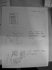
[Slim] Project 3 Storyboarding process
Man, I'm lagging behind on this one pretty bad. This past week was rather horrid. I've gots to make up!!! :)
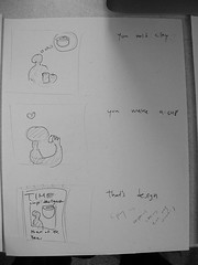
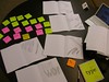
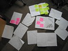
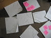
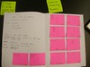
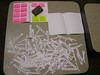
Alright, so I'm posting some action shots of the process.
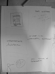
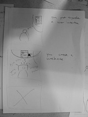
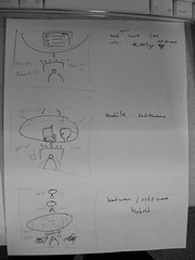
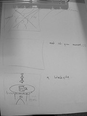
I had first thought of defining "information", then "architecture", but it didn't seem wholly necessary for the purpose, so I nixed the first bit. It also helps me keep this around a minute long, too.
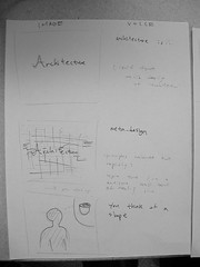
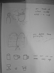
I got stuck trying to come up with a simple example for information design (a complex one would be picking something like designing a subway map, then saying the principles behind subway map translates to any sort of densely populated network of objects, but that was a bit too deep for this purpose)
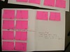
So I brainstormed a bit by randomly spewing thoughts that came to my mind on post-it notes on the wall, and doing quick affinity diagramming to find what the hell it is that my brain is trying to look for.


It turned out that a "todo list" could be a simple enough example. So I went on with the storyboarding.
Alright, so I'm posting some action shots of the process.
I had first thought of defining "information", then "architecture", but it didn't seem wholly necessary for the purpose, so I nixed the first bit. It also helps me keep this around a minute long, too.
I got stuck trying to come up with a simple example for information design (a complex one would be picking something like designing a subway map, then saying the principles behind subway map translates to any sort of densely populated network of objects, but that was a bit too deep for this purpose)
So I brainstormed a bit by randomly spewing thoughts that came to my mind on post-it notes on the wall, and doing quick affinity diagramming to find what the hell it is that my brain is trying to look for.
It turned out that a "todo list" could be a simple enough example. So I went on with the storyboarding.
Thursday, November 1, 2007
Adobe text effect presets
Here
In case you want to preview what all the text effect presets in After Effects are. There are lots (and lots and lots).
In case you want to preview what all the text effect presets in After Effects are. There are lots (and lots and lots).
Tuesday, October 30, 2007
Color links mentioned in class
In case anyone missed them:
Colour lovers: http://www.colourlovers.com/
Kuler: http://kuler.adobe.com/
Colour lovers: http://www.colourlovers.com/
Kuler: http://kuler.adobe.com/
Upgrading to OS X 10.5 Leopard?

Hey gang, just an FYI for you Mac users (all of you??):
Since we're getting into After Effects in class, I would avoid upgrading to apple's newest version of OS X, 10.5 aka Leopard, at the moment.
You can peruse Adobe's site and download a handy and infuriating chart from the home page, but here's the skinny: After Effects CS3 is going to have problems in 10.5 and an update to address those problems isn't coming until early December. Any earlier versions of After Effects (and anything CS2) will "likely encounter errors for which there is no resolution" in 10.5. How's that for technical support?
The other biggies in CS3 (Photoshop, Illustrator, InDesign, Dreamweaver, Flash, Fireworks) work fine in 10.5.
So... hold off on the update until you're absolutely done with your movie.
Friday, October 26, 2007
Some more resources
Raw Materials
Creative Commons Mixter ( http://ccmixter.org/ )
Royalty-free samples and music
Acid Planet ( http://acidplanet.com )
Artists hold remix contests here, so it's chock full of professional samples. They can be used for the contest, but beyond that licensing may become an issue.
Video References
A Vision of Students Today
A nicely done video from an anthropology professor that does a good job of communicating his thoughts on education.
Stranger Than Fiction
A movie with Will Farrell that has such a nice layer of information graphic design.
Common Craft
A company that does informational videos using paper craft
Thursday, October 25, 2007
Some resources
Imaginary Forces
The group making a lot of the clips Stacie showed.
SnapZ
The software to grab video and audio.
Web Typography
A practical guide to web typography.
Title Sequences
A cool site I found last year that has a bunch of interesting movie title sequences.
Typography in music videos
More vids, some good, some not so much.
Pulp fiction typography
Classic, in a similar style to those above.
Poetic Text
Bare text + music
Free sound project
Lots of sounds under creative commons that I've used previously.
Thursday, October 18, 2007
Wednesday, October 17, 2007

Monday, October 15, 2007
[Slim] InfoViz Poster Iterations
Just wanted to catalogue the evolution... Currently working on a variation of the last iteration and also adding colors.


Monday, September 24, 2007
Imran's first two covers
These are my old covers, modified a bit, and added color. I'm re-working the third one to make it make sense with these. Thoughts?


Saturday, September 22, 2007
[Slim] Project One - Cover One,Two,Three - Redux
Alright, revamp of the covers based on everything i've learned so far... Tried to retain much of the spirit of the originals where it made sense, and mercilessly removed stuff that was just utter crap... (not that this is that much better)
The detail polishing is absent from these as I was more focused on getting the concept executed.
Feedback is very welcome!! Rip it apart guys, c'mon!! :)


The detail polishing is absent from these as I was more focused on getting the concept executed.
Feedback is very welcome!! Rip it apart guys, c'mon!! :)


Friday, September 21, 2007
Cover three
Hey guys, I've got some versions of my third cover and I added some color. Mostly playing around with forms. Just need a little feedback, been staring at them too long. Let me know what you all think.


fall
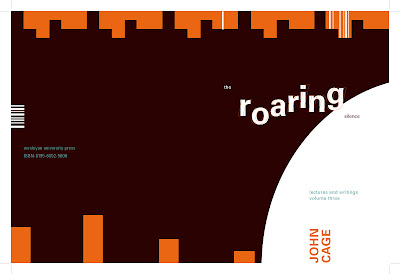
Kristen suggested including some orange in "The Roaring Silence." Any ideas on how to go about that? I remember trying, but the rose background made orange text unreadable.
-Amy Bickerton
Tuesday, September 18, 2007
[Lee] Welcome aboard and current covers
First off, fun with cover designs. The size of the "IF" is very telling: The Cover of OJ Simpsons's supposed confession.
Now, in the spirit of fairness, I'll post my John Cage stuff:
Here's 1:
Now 2. Initial nature image was a spiderweb... it's now quite a bit more abstract:
Aaaand 3. I had a pretty piano piece called "In a Landscape." Very lovely and contemplative with a nice series of repeating and eventually overlapping 6-note lines. I was trying to capture that sense of pattern and rhythm but also the piece's sense of rising action.
~Lee
Now, in the spirit of fairness, I'll post my John Cage stuff:
Here's 1:

Now 2. Initial nature image was a spiderweb... it's now quite a bit more abstract:

Aaaand 3. I had a pretty piano piece called "In a Landscape." Very lovely and contemplative with a nice series of repeating and eventually overlapping 6-note lines. I was trying to capture that sense of pattern and rhythm but also the piece's sense of rising action.

~Lee
Sunday, September 16, 2007
cal's noob question
I don't want to sound too inept with InDesign, but how do you make the bar codes?


julina's covers
These are getting close to done... any feedback on the colors? Do they work? (They are all full bleed, btw.)


[Slim] Project One - Cover Three - Prototype One
Here's my cover three...

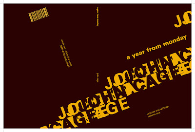
I was listening to one of John Cage's tracks that uses a "prepared piano". The notes were rich with reverb, and so I wanted to somehow depict that generation of wave as it started from the notes and propagated outwards. Some notes were hit hard, others were not, some were muted, some were not. The notes all had a tempo to it, as well. I tried to depict that through typography and shapes.
I was inspired by Carrie's nice use of paths, and also Julina's nice use of shapes that contain letters!
Thursday, September 13, 2007
Cal's Drafts
I was gone last week and regret missing the crit's most of all. Thanks for your feedback and ideas.
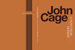
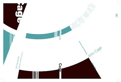
I really like embedding the Monday title in the repeating days of the week, but want to avoid a pattern that is so strong it detracts from the relevant information on the cover. I attempted to overcome this by fading them into the background.

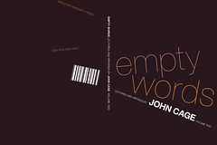
For the Empty Words cover I was building on a pattern from nature (the two slit light experiment), but feel it might be too literal. I am thinking about extending the waves out through the whole cover, but have them break down at a certain point.

I really like embedding the Monday title in the repeating days of the week, but want to avoid a pattern that is so strong it detracts from the relevant information on the cover. I attempted to overcome this by fading them into the background.

For the Empty Words cover I was building on a pattern from nature (the two slit light experiment), but feel it might be too literal. I am thinking about extending the waves out through the whole cover, but have them break down at a certain point.

Tuesday, September 11, 2007
Carrie's second assignment
 I chose an image of a snail as inspiration for my grid structure. I had a hard time coming up with initial grids, but after thinking about the meaning of "empty words", went for the idea of an spiral loosening up and falling into space.
Feedback would be appreciated!
[Slim] Project one - Cover two - Prototype 1
This is the second cover design.

This is the process I've used:

This is the process I've used:
Thursday, September 6, 2007
[Slim] Project one - Cover one - Prototype 2

For prototype 2 I didn't really capture the process because I did everything in Illustrator, and forgot to save revisions as separate files. So all I have is the final rendering.
[Slim] Project one - Cover one - Prototype 1

Photographs of the process I used to arrive at this prototype.
Subscribe to:
Posts (Atom)